
In brief: The right bedroom wall color feels calming when it suits the light, room size, and your textiles. Soft blue, green, beige, and rose tones create a relaxed foundation. Test the color on several walls, check it in the morning and evening, and combine it with warm, glare-free lighting.
Wall color shapes the mood in your bedroom more than individual decorations. It influences how large the room feels, whether the furniture looks harmonious, and whether the room feels fresh in the morning or cozy in the evening. A good color choice therefore takes the light, room size, and your existing materials into account.
When creating a bedroom color scheme, the latest trend is not what matters. The key is choosing a color you will enjoy seeing every day. Muted colors with low saturation are usually more relaxing to look at over time than very bright shades.
Which bedroom wall color creates a calm atmosphere?
A calming bedroom wall color usually has medium to low saturation. In other words, the shade does not look harsh or bright, but slightly muted. Dusty blue, sage green, warm beige, greige, or muted rose provide a versatile foundation for bedding, curtains, and lights.
Which color families suit your room?
Blue works well for a cool, clear atmosphere. Choose smoky blue, gray-blue, or a weathered teal if you want to avoid a sterile look. Very strong royal blue draws the eye and works better as a limited accent color.
Green combines calm with a natural feel. Sage, eucalyptus, and muted olive work well with wood, linen, and rattan. In rooms with little natural light, a warm green feels more pleasant than a bluish mint.
Beige, sand, and greige add warmth without a strong color effect. They work with both light and dark furniture and can be combined with almost any bedding. Muted rose adds softness to the room without being as dominant as pure pink.
- Blue: clear, cool, and calm, especially suited to white, oak, and linen.
- Green: natural and balanced, ideal with wood, plants, and natural fibers.
- Beige and greige: warm, flexible, and suitable for changing textiles.
- Rose and terracotta: soft and earthy, best in muted shades.
How do you account for natural light and room size?
North-facing rooms receive little direct sunlight. Warm beige, sand, or rose tones balance the cool light. In a bright south- or west-facing room, you can choose cooler blues and greens because natural light makes them appear less stark.
Light colors reflect more light and make walls recede. Darker colors add depth and create a more sheltered atmosphere. Room size alone does not determine the right color. A small room can look full of character with a dark feature wall if the ceiling, floor, and lighting provide enough brightness.
Pro tip
Start with a large sample area rather than choosing a shade from a small color card. Test the sample on the wall behind the bed and on a side wall. This lets you see how the color changes in direct daylight, in the shade, and with the light switched on.
How does color change the feel of a bedroom?
Colors do not work in isolation. The same shade can look friendly with light oak, modern with black metal, and much heavier with dark wood. The finish also changes the effect: Matte surfaces create a calmer look, while glossy paint reflects more light and emphasizes imperfections.
What effect do light and dark shades have?
Light wall colors make a room feel more open. They are suitable when there is little natural light or when the bedroom serves several purposes. Warm off-white feels more inviting than stark pure white and works better with beige, wood, and natural textiles.
Dark wall colors visually draw surfaces together. That is precisely their strength. Behind the bed, midnight blue, forest green, slate, or warm brown create a clear backdrop and give the bed more visual weight. Keep adjacent surfaces lighter if you do not want the room to feel too compact.
Where is the best place for an accent wall?
The wall behind the headboard is usually the best choice for an accent wall. It forms the visual focal point and still feels calm when the shade is somewhat bolder. Paint a window wall dark only if there is enough daylight and the curtain does not break up the color area too much.
A colored ceiling changes the perceived ceiling height more than an accent wall. A lighter ceiling color makes the room feel taller. A slightly darker ceiling, on the other hand, can make a large room feel cozier. Work with subtle nuances rather than harsh contrast.
If you want to combine different surfaces, materials, and colors deliberately, you can find more ideas in the Color Design category. Adapt the ideas to your room size and existing furniture.
“Colors are acts of light, acts and sufferings.”
How do you plan your bedroom color scheme?
Do not wait until you are standing in front of an open paint can to plan the color. Photograph the room in daylight and note the largest surfaces: wall, floor, bed, closet, curtains, and rug. This overview shows whether the room already contains many warm or cool tones.
How do you test the right color?
A small color card is not enough to make a decision. Paint the selected shade over an area of at least one square meter or onto a portable paint board. Use the same primer that will later be used on the wall, because the surface underneath affects the result.
- Test at least two similar shades next to each other.
- Place the samples on a bright wall and a shaded wall.
- Look at the area in the morning, afternoon, and under artificial light.
- Check whether the bedding, floor, and closet harmonize with the shade.
Do not judge the color while standing directly in front of the sample. Step back a few paces and consider the overall effect in the room. A shade that looks understated on a small sample can appear much more intense across four walls.
Which surfaces should be painted?
A fully painted bedroom feels enclosed and calm. This solution suits rooms with little furniture and clean lines. Choose a color that also looks harmonious next to the window and behind the closet.
An accent wall creates a more focused effect. Paint the wall behind the bed if the headboard is low or simple. With a tall upholstered bed, a light base color is often enough because the bed itself already provides plenty of surface area and texture.
Do not automatically frame a colored wall with white. Off-white, light greige, or a very light shade from the same color family feels softer. For a cohesive bedroom color scheme, coordinate the walls, ceiling, and trim deliberately.
Important note
Never paint over a surface with poor adhesion, moisture, or heavy soiling. Remove loose old paint, fill cracks, and check the cause of mold first. New paint only hides moisture temporarily and does not solve the problem.
Which textiles and furniture complement the wall color?
Once the painting is finished, the furnishings determine whether the wall color feels calm or restless. Limit the palette to one main color, one supporting shade, and a small accent color. Repeat the main color in at least two textiles so the wall does not look like an isolated block of color.
How do you coordinate the bed, curtains, and flooring?
Sage green goes well with natural wood, cream, warm gray, and muted yellow. Blue-gray harmonizes with white, light wood, and sand-colored linen. Beige can be deepened with brown, black, olive, or terracotta. Rose looks grown-up when combined with greige, walnut, or matte brass.
- Use curtains, bedding, and rugs as connecting elements.
- Repeat strong colors in no more than two or three places.
- Use patterns sparingly if the wall already has a bold shade.
- Choose matte or textured fabrics if you want the room to feel especially calm.
The flooring also contributes to the overall color effect. Reddish wood flooring enhances warm wall colors, while gray flooring highlights cool shades. Rugs can create a transition between the wall and the bed. You can find a selection organized by color mood in the Rugs by Color category.
When does a bed canopy work with the wall color?
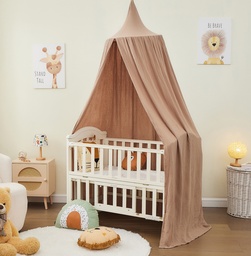
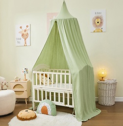
A bed canopy adds textile depth to the bedroom and changes the look of a smooth wall. Brown or natural-colored fabrics complement beige, terracotta, and warm gray tones. Khaki works well with sage, olive, and muted blue. Rose works with light, powdery wall colors and understated wood tones.
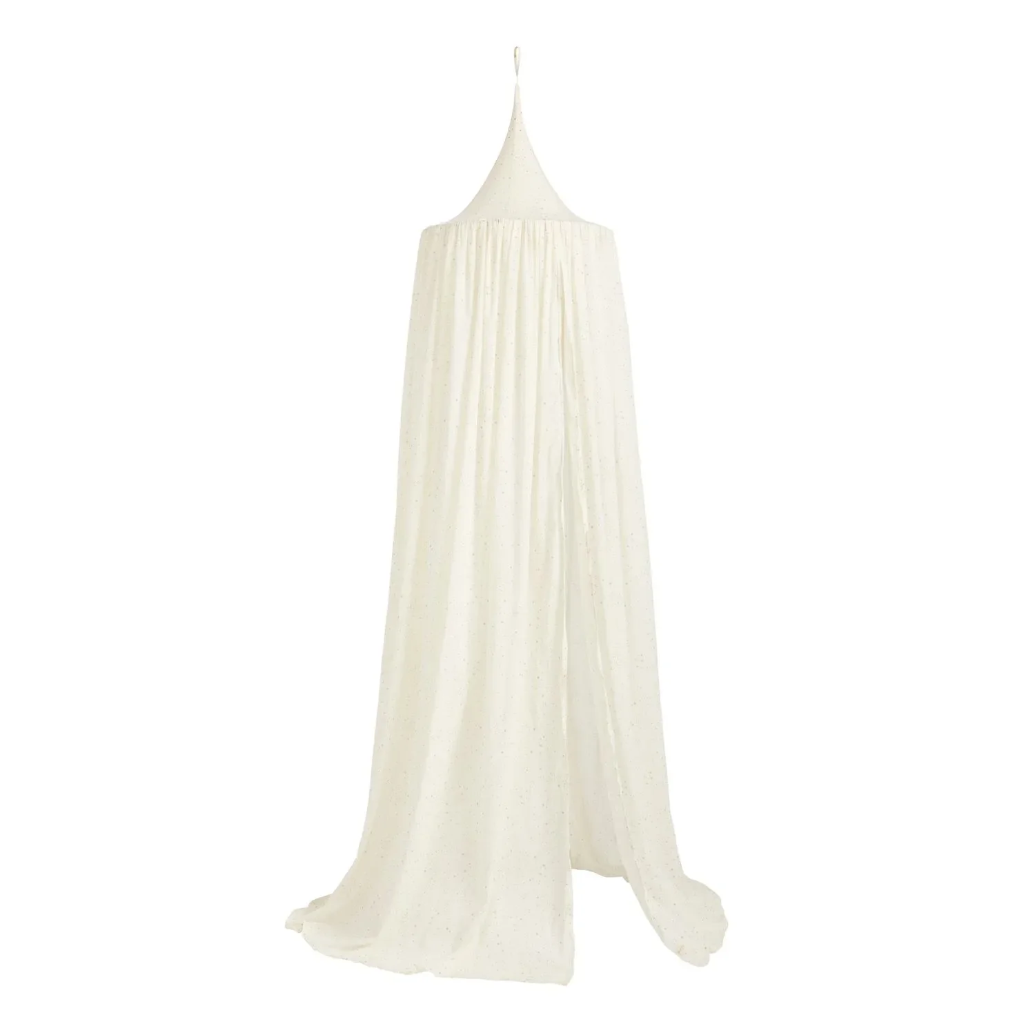
For a calm layer of fabric above the bed, options include in brown or in khaki. A lighter, more simply designed canopy such as creates a decorative focal point without completely covering the wall. You can find more styles under Bed Canopies.
Which products support the room design?
When renovating, you can consider as a suitable base for your wall color. Follow the application instructions, consider the surface, and calculate the amount you need. Then coordinate the remaining elements with the chosen wall color instead of introducing several strong colors at once.

Small details also affect the color mood. A light with a warm glow makes beige, brown, and rose appear softer. Black lights and handles create clear outlines, while wood and natural fibers make a cool wall color feel more inviting. The Design & Colors category offers more inspiration for coordinated details.
“Color is life, for a world without colors appears dead to us.”
How can you keep your relaxing retreat cohesive over time?
A good wall color needs a clean surface and a clear order of work. Empty the bedroom as much as possible. This lets you reach all surfaces evenly and avoid splashes on furniture, textiles, and flooring.
How do you paint the bedroom wall neatly?
- Clean the wall and remove dust, grease, and loose paint residue.
- Fill cracks and holes, let the areas dry, and sand them smooth.
- Prime highly absorbent or uneven surfaces.
- Carefully mask baseboards, outlet covers, and adjacent surfaces.
- Paint the edges and corners first, then the large areas using wet-on-wet strokes.
- Let the first coat dry completely before checking its coverage.
Apply enough paint to the roller, but avoid overloading it. Even pressure prevents visible overlaps. Open the window while painting and afterward, weather permitting, and follow the manufacturer's recommended drying time.
Which mistakes detract from the overall effect?
- Too many accent colors: If the wall, bedding, rug, and decorations each create a different focal point, the room loses its sense of calm.
- Choosing the color only under artificial light: Warm light can dramatically change blue and make beige appear more yellow.
- Test area too small: A sample just a few centimeters wide doesn't show how the color looks in the room or works with the flooring.
- Forgetting the ceiling and baseboards: A stark white contrast can make a warm wall color look unnecessarily restless.
- Overlooking the sheen level: Satin-finish surfaces reflect light and show imperfections more clearly than matte paint.
Additional tip
Wait until the wall is completely dry before adding the final decorations. Set up the bed, lights, and textiles temporarily at first. Photograph the room in daylight and in the evening. The pictures quickly show whether the color really feels calming or puts too much emphasis on individual elements.
How do you check the result?
Assess the bedroom after a few days rather than immediately after painting. Your eyes will adjust to the new color, making it easier to see whether the bedding, curtains, and lighting work well together. Replace small textiles first before reaching for the paint roller again.
A cohesive, relaxing retreat doesn't require a lot of decoration. A well-planned wall color, warm light sources, natural materials, and a few repeated color accents are enough. This keeps the design flexible if you later change the bedding, rug, or furniture.
Frequently Asked Questions
- What is the best wall color for a bedroom?
- Muted shades of blue, green, beige, greige and dusty rose are ideal for a calm bedroom. The level of saturation, lighting and existing materials all make a difference. Test the color with a large sample on several walls. A bold accent color works well when the bed, curtains and lighting are understated.
- Can you use a dark wall color in a small bedroom?
- Yes, a dark wall can work well even in a small bedroom. Use it selectively behind the bed and keep the other walls, ceiling and textiles lighter. Good lighting helps keep the room from feeling oppressive. Check the color in daylight and with the lights on.
- What colors have a calming effect in a bedroom?
- Muted blues and greens often create a calm, cool feel, while beige and greige add warmth and understated elegance. Soft dusty rose can also make the room feel cozy. Saturation is key: Very intense shades draw attention, so use them sparingly and thoughtfully.
- How many walls should I paint in a bedroom?
- Paint all the walls if you want the room to feel peaceful and cohesive. For more depth, an accent wall behind the bed is enough. Small rooms often benefit from a light base color and a slightly darker accent wall. Take the flooring, furniture and curtains into account when choosing a color.
- How can I test a wall color before painting?
- Apply the color to a large sample area or a portable paint board. Check it on several walls, since daylight and shadows can make it look different. Observe the color in the morning, afternoon and evening. Then decide on the final paint color.
You may also be interested in
- Bedroom design: Ideas for a cozy retreat at home
- Painting a bedroom: The best colors for a good night's sleep
- Bedroom wall decor: Ideas for a calm and cozy space
- Bedroom plants: A green oasis for better sleep
- Designing a child's room: Practical tips for a cozy retreat
- Finding the right wall color: How to choose the perfect shade for every room